Images
-
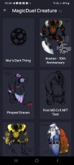
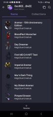
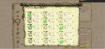
Screenshot_20230327_224813.jpg
NFTs created from the new api, in md, from bestiary creatures. You can find them also on opensea.io where you can view there rarity and such.
Currently there is no way for anyone to create such nfts, but this is just because nobody showed any interest in this feature.
I will cobtinue working on in-game interfwces for this, or i will just use them for personal transfers and rewards..depends only on your feedback
-
-
-
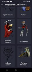
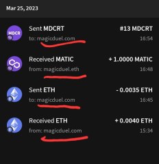
Screenshot_20230327_221129_AlphaWallet.jpg
magicduel.com is not the official erc-20 (eth, polygon) address for md on the eth blockchain.
Magucduel.eth is also a valid ens domain name bound to the official address.
This is part of a series of experiments i do in the crypto direction
-


Unch Hjar
New Member
-
Joined
-
Last visited
-
First of all take into consideration that I'm a newb so there are lots of parts I haven't seen (like tokens). [quote name='Chewett' date='20 January 2010 - 06:11 PM' timestamp='1264003880' post='53117'] Additional serverload would be increased because it may or may not need to do a sql query per person to check the time remaining depending on the table layout. Even if it didnt need another sql query the javascript would just add to the ever growing length of the page, For some players MD is already pretty slow because of all the http requests and javascript it uses. [/quote] The extra request for the time is a lot less than the request done when you click on a player name, click on fight, and get presented with a message that you have to wait X:XX time to fight that player again. MP level different presentation would be really useful, I have to click through all the list to find the people I'm allowed to attack (more server requests). [quote] To be honest, i think this idea will just make it even more "busy". It will mean that unless you scale down the already small page the bars will add padding all around it. And clutter up the area. If you look at a criture with tokens, add in these bars. it will make it look untidy. But this is ofc my personal opinion. [/quote] I agree that it may be more cluttered however I attached a file with a (ugly coloured) mockup. I remove the IDs of the creatures on the mockup.Are those used for something except for identifying creatures when creating rituals ? [quote] Checkboxes for crits! how many creatures do you have? because i have around 60 and it would just make the page massively longer, meaning i have to scroll down to check everyhting. [/quote] As I said I'm a newb, I have 16 creatures Also attached a mockup for that also
-
I'll try to keep the technical details to a minimum but I would like to clarify one thing. There's a thing called server-client architecture, in our case: browser - client remote computer server hosting the game webpage - server Operations done by the client (browser) load the server only when doing requests (sorta). [quote name='Burns' date='20 January 2010 - 11:00 AM' timestamp='1263978026' post='53094'] 1. I'm not a pro, but wouldn't having timers on all players in your current scene even add to the server-load? As in, read out and send data for players you wouldn't even want to attack? apart from that, where does a little timer go, it's pretty crowded on the scenes already... [/quote] The timers will be client-side like the timer for regeneration. I guess the timers could be done in JavaScript and will synchronize with the server only a battle is done or the page is refreshed. The rest of the time they would work like the regeneration timer, and count on the client side for display purposes. If you let the regeneration timer run for a while without refreshing the page you will see when you actually refresh that it's not accurate I was thinking the timer could go next to the name something like X:XX, it's small enough not to be a problem I guess. Also you don't need to display for all the players, only those recently attacked. And to add to this, the name of the players should show the MP level, MP3 cannot attack MP4s and vice versa. [quote name='Burns' date='20 January 2010 - 11:00 AM' timestamp='1263978026' post='53094'] 2. Hardly possible since we have 3 different requirements, at the beginning xp is the problem, in mp4 it's wins, and on mp5 people are waiting for age to upgrade, which one should be displayed? should they be mixed into one upgrade-bar, and if so, how? And, again, wouldn't reading out stats for a creature you know you can't upgrade add on traffic, instead of lowering? [/quote] It would lower because the constant switching between the main display for creatures and the detailed display is more demanding than loading once the stats. One picture alone(the one in the detailed statistics) probably takes more than 100 times the numbers for the stats. I was thinking of having 5(?) bars of different colour next to the pictures (left, right, above, and below) to show how far from the need value is the creature. Gold for VP, red for VE, gray for age, blue for xp, some other colour for AP .....Age...... VE...........VP .....pic.......AP .....XP....... [quote name='Burns' date='20 January 2010 - 11:00 AM' timestamp='1263978026' post='53094'] 3. Checkboxes would be easier, but not really a lot... just a change from one system to another... Having all on one screen might be really handy for veterans, but i guess for newbies it would be too much information at once, the way it is they can think about the things they do step by step, which crits, what should they do, how much influence, def or not, chaaarge, if all was on one screen they'd probably get even more confused at the beginning... time would tell :/ [/quote] This one, I guess, is a matter of opinion, as a newb I was confused by the multiple layout Another issue that I have with the current setup is that if I make a mistake I have to redo the whole thing back from selecting the creatures which annoys me to no end. Using checkboxes you do 6 clicks maximum for selecting the creatures. Using the dropdowns you do at least 12 for selecting all the creatures plus checking that you have not selected the same creature twice. With the checkbox system this is immediately apparent (and impossible ). Name field (btw, why does this appear in the defense selection screen ?) (maximum?) 16 Checkboxes 4x4 grid, the creature abilities dropdowns are enabled when the creature is selected 1 slider for attack VE 1 checkbox for defense 1 slider for defense VE (appears if the checkbox for defense is selected) Attack Cancel Doesn't seem to be a lot of information.... 5. The combat report makes my eyes bleed and want to murder fluffy kittens. I keep trying to read it and giving up every time... A little structure would go a long way....
-
I have been playing the game for about 20 days now and I noticed a few things related to the interface that may help people and server traffic (if that is an issue). 1. Combat. In the regular screen when doing combat I (and assume others also) check when the timer for reattacking a player has expired. This is done by clicking on the player name and on attack. These two clicks could be removed (and the traffic associated with them) by having a small timer next to the names of the people recently attacked. When in Marind Bell there is also the extra check to see if players are idle (one click on name for *each* player), this could be removed by having idle players names have a different colour or have a marker next to them. 2. Creature screen I often find myself checking for upgrade statuses (needs) for various creatures. The clicking to get to the extend information could be removed by having some small bars underneath the creature to show how far they are from upgrading. 3. Rituals When creating a ritual there are 6 dropdown boxes to select creatures from. It would be a lot easier to have a number of checkboxes next to the creature insted of the dropdown boxes. The dropdown boxes are annoying because I have to double check that I have not selected the same creature twice each time I click on a dropdown (not to mention that they cover the creatures already selected). Also, having several steps for creating a ritual doesn't really make sense, all that information could be in one page saving all the continue clicks and the server requests. 4. Buttons sizes Buttons are too small, making them larger should make them easier to hit (standard GUI improvement). Add any ideas to the thread. Unch