Images
-
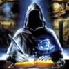
Screenshot_20230327_224813.jpg
NFTs created from the new api, in md, from bestiary creatures. You can find them also on opensea.io where you can view there rarity and such.
Currently there is no way for anyone to create such nfts, but this is just because nobody showed any interest in this feature.
I will cobtinue working on in-game interfwces for this, or i will just use them for personal transfers and rewards..depends only on your feedback
-
-
-
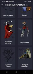
Screenshot_20230327_221129_AlphaWallet.jpg
magicduel.com is not the official erc-20 (eth, polygon) address for md on the eth blockchain.
Magucduel.eth is also a valid ens domain name bound to the official address.
This is part of a series of experiments i do in the crypto direction
-


Yasrin Luvien
Member
-
Joined
-
Last visited
-
-
-
-
It certainly could be employed. The reason they are mostly lines is probably because they start off smaller when I am first making it from the sensation of the concepts. Also I probably lean towards easier to draw again symbols because I usually am making symbols I intend to utilize practically. But for something like this, a more universal truth, could have and likely deserves some embellishments. Since within the principles are infinite complexities resulting in reality, I don't see why the symbols themselves shouldn't be more complex. Anyway, I will give that a whirl!
-
-
-
Having trouble editing the original post, so here is the better drawn version of Transposition Wanted to finish drawing reasonable looking versions before putting them together is a single image, I guess? I'm trying to hurry!
-
-
-
-
-
-
-
-
In Syntropy, the center was representative of the void, and a triangle is the first solid shape to form. The central triangle was upright to represent the manifestation of the first flowing from the void, or the solidification of the beginning of a thing. The echoing inverted triangles behind it represent the subsequent emanations from the beginning through the various layers of existence, flowing from a tripled vesica pisces, another form representing creation. The three spikes were flowing from the center as well, to the ends of the manifesting triangle. The idea I got was they were pure forms beginning from nothing, but there was also an inspired element that makes describing these difficult. They are more of a sensation than a methodical construction, though both elements are involved. I would like to see others' renditions of the principles, be they variations or entirely new. I've yet to get the chance to observe comparisons between my transpositions of thought forms and others. I suspect that symbols may work in particular for the person who created them, and be more hit and miss within a populace, as everyone has a different perspective. Symbols seem to be visual gates for a certain perspective, and though I would like for them to tie to the direct truth of a nature, I cannot say how effectively I may have blinded myself by my own interpretation. Thanks again for the praise :P
-
-
-
-
Okay, good to know.
-
What would be the ideal format for these to be finalized in? With pencil, ink, or on the computer? An example of a symbol I have drawn on the computer turned out like this: Though I could likely improve on that.
-
I understand how Light and Darkness could be forces, as well as entropy and syntropy. They certainly are forces, but I think there is relevance in their designation as principles, because they extend beyond their physical components and have applications in mental and social (among others that my brain is refusing to offer up just now) spheres. I think the main difference between a force and a principle is whether or not it sits in a physical or mental category. However, reality seems very tied up in a mental, and therefore philosophical, nature. Since we perceive everything through the mind, is there truly a difference between a force and a concept or principle? I think even the most mundane physical things have their philosophical counterparts. I think that reality is more a principle than it first appears to be.
-
I certainly agree! I am really quite honored. I will put the time and effort they deserve into them. When I first started them, it was to decorate an avatar, though I had every intention of making the symbols as accurate as possible. Here is that rudimentary sketch I mentioned (the idea for that avatar that I started so long ago). (As a short aside, I was pleased to see that Mur's post suggesting the symbols be used in-game was #22, which is my favorite number and holds quite a bit of relevance for me)
-
Thanks! It is eye-like, for a reason! Time is more of a perception thing than a strict reality in itself. Most of us have been aware of the alteration of time at the basic "This day is taking forever" level. Time looks like a reality from the point of perception, but removed from that it can be viewed as a simple state of existence. I am having trouble describing this a little... The idea in the symbol was that what looks like the sphere of time (our perception of current reality) is in fact an illusion, based on the reference point. Seeing Time from the outside (viewing the symbol from an outer reference point and not from within) one can see that there is not a solid existence but a wave defined by perception. I made the eye extend beyond the inner circle of perception because I believe that though our bodies are located in a reference point to time, our perception can extend beyond that, and may even do so without our conscious awareness.
-
Took me forever (like usual), but I haven't disappeared! I drew up Time, and updated the original post.
-
Working on Time, which revealed itself with relative ease. I already had a mental grasp on the nature of some of these, making the distilling into symbols easier. Having a little trouble with Light, though. If you'd like, Fang (or anyone willing to expound a little!) we could hash out some aspects of the Light Principle? So far, I've been considering the nature of lights reflectivity, how it moves in a sphere from a point and scatters across its environment. Also I was considering how everything projects a shrinking image of itself in a sphere around itself. This is true for aspects as well as physical reality. When Light is revealing say, a thoughtform of some sort, the information is projected from the source in the same way. I have a lot of thoughts about it but a more complete grasping of the concept would be ideal. For Cyclicity, the idea was that in the inner or smaller circles, the entire symbol was reproduced. I can see why the symbol for Balance could represent Cyclicity. The idea behind the symbol was that it contained three sets of yin and yang, as well as two balanced and interlaced triplicate unified sets. Each triplicate represents a unified and solid aspect of reality that is at once whole and balanced with its opposite. Honestly a yin and yang probably would portray Balance very well, but then it is quite a multifaceted symbol. I did like how this symbol turned out though, with the hexagram in the center, another symbol balance and the uniting of opposites, which is in spiral. These all were geared to be circle based, so they could be drawn around the perimeter of a larger circle. Maybe I will post a very basic sketch of that?
-
Well, to be frank I am quite honored by the positive response! I have enjoyed our meeting! I don't really care about in-game favors, we could talk about symbols and perception if you'd like. They are very nearly my favorite subjects. But in any case, I will finish the Principles. Here is Darkness. https://lh5.googleusercontent.com/KhPimULmEYBXomcpGtk1DnaZ00SfztHKiJQnEiNIUCcA=w594-h591-no I will enjoy MD! I always have. I've been dipping in occasionally for several years now, and have seen a little of its history go by. The Principles always thoroughly interested me. If you're to ignore me, I'd just like to say I really enjoyed your book! It's the sort of book I always wanted books to be. Mind opening and motivating.
-
Awesome! Yes, the lines were supposed to meet, must have smudged off the page. That turned out great! I am working on Darkness now. It's exciting to have other people work on symbols with me! (I probably draw symbols a lot) Not sure why I didn't think to scan them... I will draw them on white paper and do that.
-
I will, then! I'm pleased there is some interest! I was sort of planning of dropping them and running away, haha.
-
Also, I could draw symbols for the other Principles if anyone is interested. It would make a good project to bring me back to MD.
-
Go ahead! And there should be better quality photos now. Thank you, dst! :))