Images
-
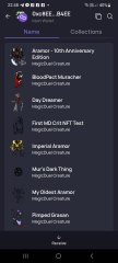
Screenshot_20230327_224813.jpg
NFTs created from the new api, in md, from bestiary creatures. You can find them also on opensea.io where you can view there rarity and such.
Currently there is no way for anyone to create such nfts, but this is just because nobody showed any interest in this feature.
I will cobtinue working on in-game interfwces for this, or i will just use them for personal transfers and rewards..depends only on your feedback
-
-
-
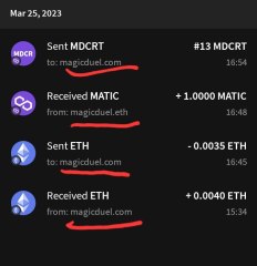
Screenshot_20230327_221129_AlphaWallet.jpg
magicduel.com is not the official erc-20 (eth, polygon) address for md on the eth blockchain.
Magucduel.eth is also a valid ens domain name bound to the official address.
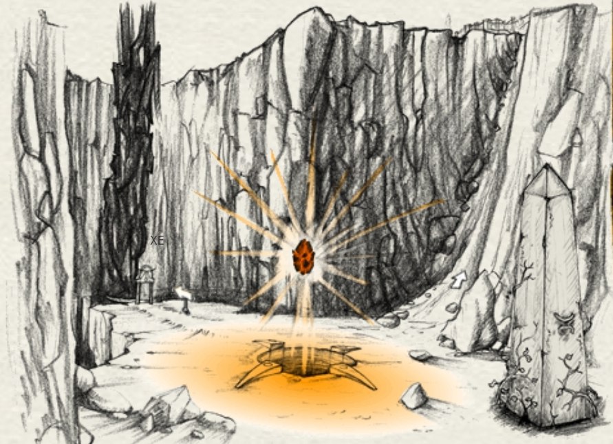
This is part of a series of experiments i do in the crypto direction
-


Lazarus
Member
-
Joined
-
Last visited
Everything posted by Lazarus
-
I'm not too sure if I will make it that day, but I'd like to sign up just in case.
-
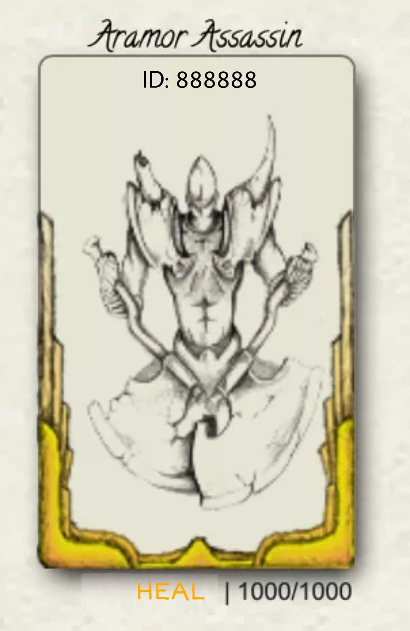
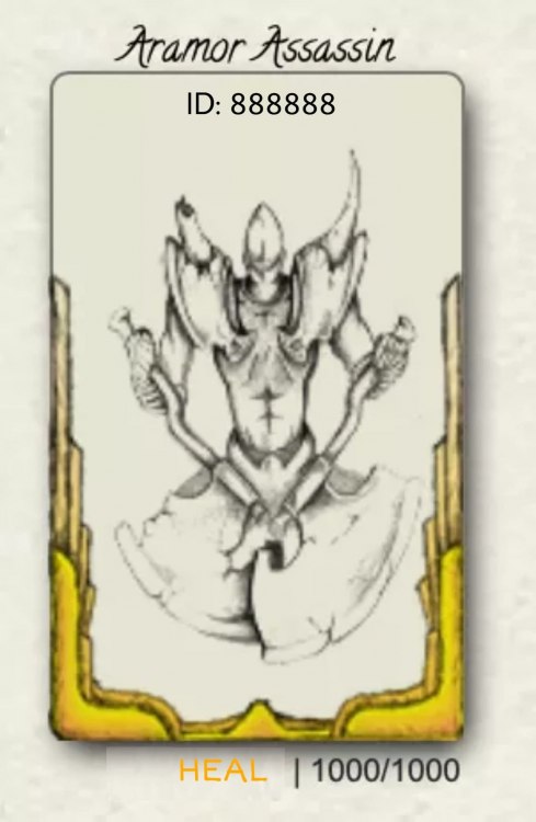
I agree with this. While I do like the idea of a Trading card-looking concept, it makes the images warped, cramped, bulky and take up a lot of space. I would be willing to try and redesign this myself but I can only suggest to simplify this UI as much as possible as I am oblivious to the coding limitations of this design. I suggest that the images be scaled proportionally with length and width if the full image of the creatures are to be used rather than thumbnails. The "+" button size indicating an upgrade be reduced to at least 50%, it's too big, and the lightning effect that comes with it be removed. But for now, my suggestion is to replace the section where creature ID is at with HEAL and creature ID be repositioned in the creature card itself, it makes sense that when the card is clicked, it'd take you to the creature page, and when the HEAL is clicked, well, it heals.
-
@Ledah I'll send you the CTC via forum PM as soon as I can, I'll be idle at GoE. Thanks!
-
This will end in about 6 hours from now. Current bids: Pip - 5G 20S for 1 Ledah - 6GC for 1 Fang - 6G 1S (unclear if for one or both)
-
Apologies, I made a mistake in the title, these are Level 1 - 15th Anniversary Barren Souls, not Hollow Warriors, they have 8 more days to go before they can be uplevelled, but starting price will remain the same. You can reset your bids or keep it as is.
-
I have two of them, I don't know how much they go for so starting price for both is 4GC or 2GC individually. Bidding will end 72 hours from now.
-
Thanks Chew. I still have 145 Plushies left to trade for. 4x Item 3: Avatar Goldening Token - 100 Plushies 3x Item 5: Send to Gazebo - 45 Plushies
-
2x Item 3: 50 Plushies 2x Item 4: 24 Plushies Total: 74 Plushies (3 remaining Plushies from Lazarus' inventory plus 71 unclaimed Plushies from lashtal's inventory. I may add more items, depends on Plushie Auction results.)
-
Item 1: 45 Item 6: 135
-
Item 6: 126
-
Thanks, I missed that update somehow.
-
I might be misunderstanding this, but according to the rules above, all items except for item 6 (maybe item 2 as well) have already ended since the last bid on those items had been more than 7 days which implies that those players who last bid on them already won those items, now the current end date of this auction is the 28th of August. Are we now only allowed to bid on item 6 and/or 2? Or every item is still available to bid on despite the current bids already being past 7 days? Item 6: 121
-
Item 6: 96
-
Wind drachorn: 91
-
Item 6: 86
-
Item 6: 81
-
Item 6: 76
-
Item 1: 35 Item 6: 70 Item 8: 70
-
Item 1 - 25 Plushies Item 6 - 40 Plushies Item 8 - 60 Plushies
-
I didn't know I won lol. I'll take the 7GC Miq, thanks!
-
For Taurion Item 3: Avatar goldening Token: 25 plushies Item 9: 15th anniversary spicy pickle: 5 plushies Total 30 Plushies from Taurion's Inventory.
-
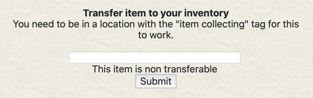
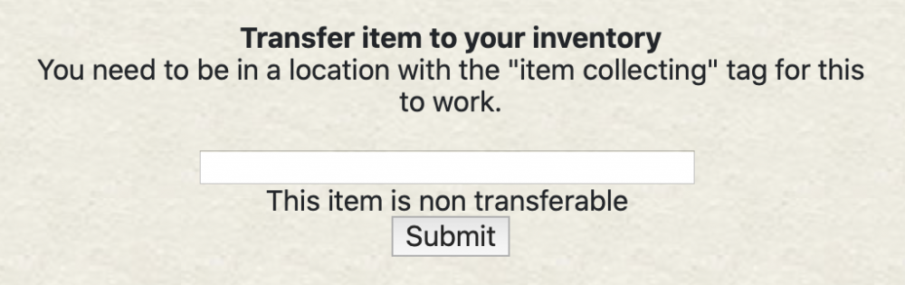
We usually get an announcement when the Plushies cease to be transferable, but this time there were no notifications in the updates section so lashtal thought it could still be transferred. He sent me all 70+ or however much there were ITC's of the Plushies but when I tried using them, this is what I got: So they are not transferrable in any way at this moment.
-
This is closed, but looks like the Joker is the only remaining one up for grabs. I'll accept whatever for it, or even give it for free, just PM me and I'll send its CTC. (Didn't mean for that to rhyme)
-
Thank you for making this quest lashtal, the artwork submissions were all great! Though I felt really overqualified for this, so I wish to part 15 of these plushies and give 5 each to Ungod, Steno and Ailith, I was planning on doing it myself but since the Plushies had become non-transferable I thought it would be helpful if I declare it.
-