Images
-
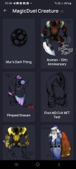
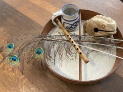
Screenshot_20230327_224813.jpg
NFTs created from the new api, in md, from bestiary creatures. You can find them also on opensea.io where you can view there rarity and such.
Currently there is no way for anyone to create such nfts, but this is just because nobody showed any interest in this feature.
I will cobtinue working on in-game interfwces for this, or i will just use them for personal transfers and rewards..depends only on your feedback
-
-
-
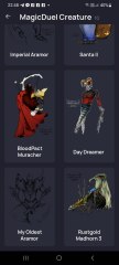
Screenshot_20230327_221129_AlphaWallet.jpg
magicduel.com is not the official erc-20 (eth, polygon) address for md on the eth blockchain.
Magucduel.eth is also a valid ens domain name bound to the official address.
This is part of a series of experiments i do in the crypto direction
-


Syrian
Member
-
Joined
-
Last visited
Everything posted by Syrian
-
as azull's anno link shows. dust comes from breaking stones, mwhich grants temporary spells. you won't be able to buy permanent spells from players
-
autumn2050
-
maybe we just add (Click the cube) at the bottom of the story text just incase nomeone eles has the same problem
-
list disappears for me as well on narrow view
-
yeah it can be a nuisance, thankfully it doesn't matter *too* much for non perma mp3s, but that's a whole other thing
-
it's to point at the "cap" of growth for your creatures, but if they stopped allowing profile changes when at cap, it owuld be an issue for mp3's who cap early and then can't reach 100 wins and losses to progress.
-
-
-
i think this makes sense if heat veins are outside the bounds of the scenes themselves, or rather, don't exactly interact with the scenes in the same way that we do. a scene that might be blocked for us may not be blocked for heat veins, either because it goes under the map or just doesn't interact with the "physical" scenes themselves . so in the case with chew's example, LR to NC the long way would be 28 (capitol to capitol) . LR through the back entrance and down through alches would be 20 if you count the tunnel of war being a viable "shortcut". however this may not be the case if heat veins are static "tubes" and were formed before that event. i would think that heat veins would be a mix of both, more like air dynamics but in this case, static in the sense that they are an unchanging "moment" of probability. so it would depend on how you interpret the sequencing of these "events". if the tunnel is not a viable shortcut, LR through alches to the GOE into DM would be 32 through MDA and tunnel would be 26 i believe heat would take the shortest option due to what chew said with teh path of least resistance
-
this was my thought too after reading mur's last post, not as considering it to be NML's heat source, but it's a very "confusing" place, in that i t would be hard to decide in which direction to travel, if one option is possible, but the option is null. there are too many routes to be able to decide. maybe the flow is too great to actually move against it in that case, too much turbulance
-
-
add a scaling percentage recruitment modifier to the current recruit cost based on how many creatures that player already owns. so for eg, 0-14 creatures = 100% 15-29 creatures = 120 30-49 creatures = 140 50-79 creatures = 160, 80-139 creatures = 180% 140+ creatures = 200% so have each "bracket" of creature cost, have more creatures allowed than the previous, and eventually cap it out. when you consider how much the rarer creatures cos,t having a ton of creatures is going to be very punishing and promote more planning. the numbers i suggested arn't really something i would think to suggest, just an example to show the kind of scaling i had in mind. each "type" of creature can also have a different modifier, so shades maybe don't get much more expensive, but an aramor would get much more expensive very quickly, up to maybe, say, 500%. creatures targetting at early new players or new accounts would have a much moer punishing modifier, whereas the creatures intended to be "late game" would have a much less of a modifier
-
or get friends to reroll alts to do it for them
-
i think a % can work if you making it a scaling percentage. so as you increase your max WI you can recruit a higher number of creatures. maybe that 30% would go down to 25, then 20, then 15, then 10, so it still rewards stat progression. if you have millions of WI to start with, making it a flat 30% is just going to feel punishing for having put in all that effort to get there and remove all sense of acheivement for putting in the grind. if it's 30% plus a flat number, then you can only ever recruit 3 creatures , however, if you have mililons of WI, it's going to take you MUCH longer to regenerate that 30% to be able to recruit another, than say a newbie with barely any. the solution to that would be to make WI regerenate as a % , but then again, then tha tjust removes the point of farming WI to begin with, and it might as well be the same fixed value for everyone
-
i think the problem with this is that it removes the idea of progression, and actually makes having low Wi much better. if it's going to for eg, cost 10% to get an aramor, theres no sense of it becoming an easier process as you get stronger. but let's also say that some creatures use more Wi than you have currently. there are two options: 1 make it a % over 100, so for eg, 150%. or cap it at 100% the first option would mean that having LOW wi would be more beneficial, because you need to gain less to reacgh 150% , 10,000 > 15,000 means only needing 5k instead of 100,000 > 150,000 needing 50000. this would mean as you get "stronger" and should have an easier time in the world, you actually have a *harder* time if we go with the second option, that would mean that theres no sense of progression and working towards those goals, there would be no reason to fight or train to reach the things beyond you, because everything is attainable with the default amount
-
-
-
-
-
i think also you could take the title of the bottom right menu "inventory, public logs" ( https://gyazo.com/b5fb7c94d27dd6a037459f7e8cf18c58 ) etc , and turn that into an expandable list/ menu rather than having icons at the bottom of the screen, as you have to go to the bottom to open up a menu, and then back over to the right to interact with what you wanted to open. this could then mean the bottom popup section could be used for player stats, such as AP/VP/Heat, inside it's own box, rather than floating above it and clipping with other text inside the page. edit: i definitely DEFINETLY did not do my idea's and thoughts justice, but here is a terrible paint edit of the idea''s/placements that i was talking about , hopefully my terrible editing skills doesn't take away from the ideas about the page layout. https://gyazo.com/241e801cfd78bb5fe4c99111a36692d8
-
willpower is a pretty good representation. willpower is a finite human resource to begin with, so it would be a re presentation of how much a player character can "do" before they have no more willpower left. humanity as a whole struggles a lot with willpower, and tends to spend it on useless things, and then being unable to do the things that they would otherwise need or want it for. it draws real world parallels, because when people run out of willpower they tend to be unable to do anything else with their day, and need to recoperate, much the same as AP.
-
i actually really look those minimalistic UI boxes on the right, the one's shown in chew's screenshot. is it at al possible to get a total theme like that across other elements such as the menu bar at the bottom? i think it might also be nice to have one of those menu's on the right that pop in for the heat orbs as well , with the option to pin , that way there's some overall symmetry and consistency between side elements. it's really comfy to have those elements on the right scroll with the user now tha ti've played around a little bit with the UI, and it would be nice to have the hdeat orb element do the same as well edit: would it be difficult to add a global text scale modifer to the whole site? having the chat text a few points larger is a huge help but some other elements are very tiny as well
-
-
firefox, 1920x1080 ultrawide screen. i think a feature like that wuld need to be togglable, beacuse scene's are valuable and it could risk covering up important details. but it does look pretty cool having my avatar in the scene like that yes, but it blocks arrows in some scenes ????
-
https://gyazo.com/dc502d8fb7314806fd8c0fb07599982e it seems to overlap the scene instead, it works fine on other views