Images
-
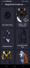
Screenshot_20230327_224813.jpg
NFTs created from the new api, in md, from bestiary creatures. You can find them also on opensea.io where you can view there rarity and such.
Currently there is no way for anyone to create such nfts, but this is just because nobody showed any interest in this feature.
I will cobtinue working on in-game interfwces for this, or i will just use them for personal transfers and rewards..depends only on your feedback
-
-
-
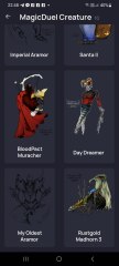
Screenshot_20230327_221129_AlphaWallet.jpg
magicduel.com is not the official erc-20 (eth, polygon) address for md on the eth blockchain.
Magucduel.eth is also a valid ens domain name bound to the official address.
This is part of a series of experiments i do in the crypto direction
-


Muratus del Mur
Root Admin
-
Joined
-
Last visited
Everything posted by Muratus del Mur
-
-
-
The other auction is up, so now you know all the major auctions i am running while gold and tst value what they do now. Focus you bid on the item you want more. Last accepted bid for this item is: Miq for 5TST and 10Gc (equiv of 110Gc). Once there will be a couple of days without any new offers, i will consider the auction won and closed. I will close this auction also when the new interface will be moved live in a week probably.
-
Context: New interface will allow transfering of creatures without severely reducing their age and other penalties , if paying the price of one Silver Coin per such transfer. There is an other way to transfer crits without penalty, without the receiver to need any coins (great for quest rewards, gifts, etc). This is by "MagicCTC". If the word "MAGIC" is present in the CTC, no penalty is applied. This auction is for item: [QM] Timeless Transfer Enclosure Description: Can enclose a creature in a timeless protective shell to allow it to be transfered without losing any information. (Magic CTC) This item can be used every ~2.7 hours to Item can be traded/trasfered So now this functionality costs 1 silver per creature, silver that needs to be paid by the receiver. It might not be a gold mine, but its still valuable. Your services using this item cold be priced per bulk, or use it for creating penalty free transfer codes, or for personal unlimited use so you won;t have to pay for this feature ever. I might increase the 1 silver cost of the interface, or make it variable based on creature, i am not sure yet but its possible, but for now consder this minimum price of 1 silver pe trasfer when estimating the value of this item. You receive the item, with UNLIMITED use, and a role tag of your choice that needs to be fit a related role (something related to creatures, transfers, trading, be creative but not delusional) It comes with one restriction, you are not supposed to offer such services for free without reasoning, that would disrupt the other hardcoded feature. You can use it for all your creatures, or use it for any creatures meant to be quest rewards, or charge something for using it (anything at all, you decide), or impose some sort of rules on when or on what you use it, just don't start magicctc-ing random crits every 3 hours for anyone asking, or i will be forced to increase this timelimit to much higher. Please note that the cost for penalty-free transfers in the interface, and the reuse interval of this item , could change without further notice. Let the auction begin. Accepting gold, silver (15 silver per 1 gold) and tickets (1 tst = 15 gold here)
-
This post is for discussing the upcomming shop changes. First of all i am sorry i will shake the economy severely with this change, i realize that, but gold and silver is too "rigid" right now, it needs to be more fluid. People having coins got them over long periods of time, too long periods to consider coins a usable commodity for everyone except the rich. Please use this topic for comments on this, or suggestions, but i have to say, unless you reveal a serious flaw in my judgement, this change is set and will become active with the new interface as it will be. There are other changes that will affect the economy and trading in the new interface, things like making it easier to trade creatures without penalty, and more. Some things might remain forgotten at this time, like coin rewards hidden in shop or wishshop, please point them out in case you think they are no longer ok and i will consider it.
-
-
Also TST is not just about spending a lot. Tickets are given on rare occasions out for high spenders even if they already spent. They run long time without any value so they could be traded for very little at the right moment, so someone still active, with tickets, is a player that got involved heavily and is still around..this for me means he/she is a member of the community thst will continue to be around and could put importsnt tools to good use. Now while being more active with the new interface, i might release other things out in exchange of tickets, just to keep them existing in-game. Such autions are intended also to gather gold off the market and by that increase its importance, they are a natural and much needed economic process to keep the community balanced and avoid inflation, espexially after very long periods. I am explaining all this for who wants to learn something
-
I don't intend to set their value to a fixed equivalent. As i said, this conversion rate is foe this auction only, sometimes can be less, sometimes more, depends what i want to achive with that. TST is an indicator of old time supporting players that helped md but never used tst for anything, so i am giving them an advantage in role defining auctions. Tickets will always be used for such things or in auctions where only tickets are accepted, and since these auctions are rare, i thought to give them a boosted value. I hope it makes sense. Highest bid: Miq for 5TST and 10Gc (equiv of 110Gc)
-
-
-
-
This auction is for the item, you can use it do develop your own role, or resell it later. The reason i am auctioning it is because i want its functionality back in game, and i know of no one active that could receive it as reward for a role. The item allows you to constantly create Wiiya bubbles, that you can then sell or offer as part of your role and create a small ecosystem around you. These things are usable, check to Shmsh guid, or ask around. In addition to the item, the winner is also entitled to a custom tag of his choice that must contain the word "Wiiya" in it (not mandatory, only if he so wishes) I reserve the right to cancel the auction if i feel the total gold is not enough. I don't want to impose a starting bid because i don;t know to estimate its value correctly. Wiiya Bubble Weaver The Bubble Weaver creates bio-degradable bubbles that can collect Wiiya gas. Accepting in this auction: Gold (in any form, coins, notes, items containing gold or made of gold according to their description) and Top Spender Tickets For this auction only, due to its nature and all, i will consider one spender ticket to be equivalent of 20 gold. (if i estimated wrong please pm me with explanation)
-
transfering 36 gold now. please send back codes. Thank you
-
I need to restore my gold supply. While i could basically give myself unlimited gold, this would ruind MD economy and would make any value concept pointless. Every time i reward or pay gold, i do so from gold i obtain through some form of value exchange, like this one. This auction also adds a bit of spice and role potential. This is a rare functional item, its description sais what it does. Its use might not be really something you want, unless you want it I do not guarantee that myself or chew won;t use other ways of traveling in case we need to chase someone that has such item, but for the rest, this is hardcoded so it will work. If any of the A25 holders want to bid, please consider this item will severely impair our collaboration, as magic is still the most convenient way i could travel to you when needed. I wont be responsible for this if you decide to hold such item. Scent of Mislocation Whoever has this scent can't be followed by anyone by using magic. It is a cool thing to have, unless you don\'t want to have it. Auction starts at 1Gc, i accept only gold, in any form. Auction ends whenever i consider, and payment needs to be done when it ends, within few days.
-
an other one time bid (wont compete if you wish to get them, otherwise i bid minimum so i get them for my collection if nobody else does, thats the point): 15gc 15gc
-
bid for the golden avatars, this is one time bid, if you wish to get them for more i wont compete. 3 Gold each Ps. if my bid gets accepted please be so kind and pm, i am stuck with my head in code i wont be checking back here too soon.
-
Its behavior shouldn't be changed, i just placed it differently.
-
Made several fixes both to super small screen and very large screens. The top menu will hide several less significant items on smaller screens also. No more horizontal scrolling and better overall layout. I hope it makes a difference. I will continue placing unfinished things such as stats, or remove them maybe. Its starting to get better. Ps: Also, just because of Nava, i made it so jailed people can't use the moodpanel anymore, but once i will put the new interface back it will be possible. I am still thinking if to leave it so or still allow jailed to use moodpanel.
-
I know, but its still a good ideea if you ignore the fact there are not enough people to make it usable. I don't want to cripple the interface just because there aren't enough people right now. I could hide it based on number of lho or online people, but i don;t want to remove it yet.
-
Thanks , much more helpful answer there are thibgs i don't know where to fit yet, live help button is one of them for now. i see most of the issues come from resolution, what is the resolution you talk about? Mobile or desktop? If desktop, what is it exactly? Thanks for the details
-
Lets get this going. Azul, Ungod, Aia, you have all you need. Aia please send them the converted files. I have nothing against splitting the tasks among all 4 as you decide, so you should talk about this. I will summon you all in one place in MD and WV. You will probably need WV as a reference in case you missed somehting. Be careful, some scenes in WV where changes as we where testing stuff, dont do the same in MD. Shem, I will give you the tools and you try to convert a scene, if you succeed and wish to coninue, great, if not, no grudges. Lets continue this in-game Thank you all
-
@Fang Archbane I denied you application because of two reasons. I received a valid message against your application (it was an argumented one not a hate pm), and we have already enough participants to go on with this. Thank you for offering your help anyway.
-
yeah i know what actually happens is that everyone got used to current md, it gives a certain feel of "home", and now everything "changed". Current md had the details put in order, i put much time and care in that, over the last 14 years, and this is an interface that was done in a month, its not the same thing. This one it will take probably an other several month to look pixel perfect, to get the colors right and so on. Let me tell you a story about the curent interface, and why i used the same "tree bark" and paper edge .. When i started md i was really a beginner with interfaces and such, especially with image editing. Back then both the technology and my skills where not that much. To make that tree bark and paper edge, i made an actuall picture of a tree here (still there the tree) and crumbled some paper to scan that edge...i still have that paper ..I wanted to keep same design elements in this new one because they hold a bit of a memory for me, reminding me from where it all started. The colors where not random. Due to my synesteshia (i confuse colors with numbers and shapes all the time), the current md interface was a masterpiece in terms of what it did to ones perception when looked at. It It was supposed to give you a light feeling of home, and was going in harmony with a very slow gameplay (something that is no longer the case nowdays). The new interface on WV was mainly done to save md from the flash apocalipse :P, and its ok for that, but i didn't got to the really important details yet. Erolin device is 80% done from this perspective, the details are in the way the orbs move and their palcement, but there are things that don't fit well together, and people can't see what is not ok, hence to overall feeling of "meeh.."... I just wish you could see how much of an improvement this new interface is from a technical point of view and how hard it was to do it ..just think how many things i had to totally recode from scratch to do in html instead of flash..chew knows how hard it was when he did the creature page. When i see negative votes i feel kind of disapointed in myself, but i do appreciate your negative votes if they come with an explenation, so i can work on improvements, like i did with the vertical mobile view last I am not sure if you realize but i am trying to tailor this interface to you, a handful of people that look at it, so a bit of cooperation would be great Thank you to all those that gave me feedback
-
The amount of work i had to do to get it to this stage was simply insane, so once i got it to a functional state i forgot the details are important ..thinkin i can do this later too. You are absolutely right, there are many things that need improvement. The vertical view on phone is acceptable for now, ..i know it needs so more "love" but i will get back to it later. I will try to improve things on landscape too, but i need a break. Job is pushing me with "super important do now or die" stuff too, and i slept so little past weeks.
-
Oh, forgot to mention, i removed animations for mobile view, will be less cpu intensive, and heat is usable now in this mode too (slots will show nicely in the left edge)